

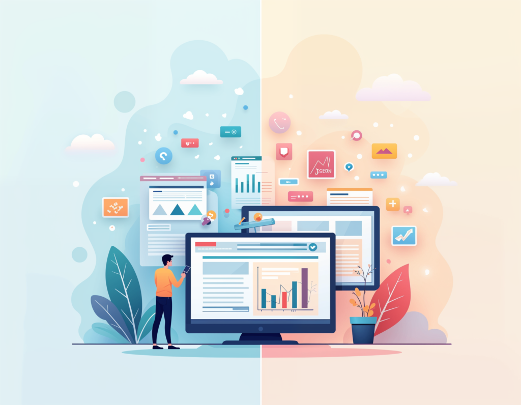
Does a beautiful website guarantee conversions? When it comes to good design vs. conversion, the answer may surprise you. While eye-catching aesthetics can attract visitors, prioritizing style over usability often leaves users confused or frustrated, reducing the likelihood they’ll take action. To create a website that truly converts, it’s crucial to balance visual appeal with a user-centered experience. Let’s explore the pitfalls of “design-first” thinking—and uncover actionable strategies to transform a beautiful site into one that drives real results.
1. Pretty Doesn’t Mean Practical
While a beautiful design can initially attract users, it may lead to a frustrating experience if it lacks clear, intuitive navigation. Overly complex layouts with too many elements can make users feel lost or overwhelmed, creating barriers to action.
- User Clarity: Busy layouts and excessive visuals often leave users uncertain about where to go or what to do next.
- Prioritize Usability: Visual appeal is important, but it shouldn’t overshadow the clarity and usability of key functions.
- Quick Fix: Simplify the navigation, ensuring call-to-action (CTA) buttons are prominent and easy to access, so users can move smoothly through the site.
2. Simplicity Beats Complexity
Too many design elements or options on a single page can cause “choice overload,” leading users to feel overwhelmed and abandon the site. While visually packed pages might seem impressive, they often result in lower engagement and higher bounce rates.
- Avoid Overload: A page with excessive visuals, animations, or buttons can cause decision fatigue, pushing users to leave rather than explore further.
- Encourage Focus: Simple, streamlined layouts help users quickly find what they’re looking for and guide them naturally toward taking action.
- Quick Fix: Strip the design down to the essentials. Create a clear content hierarchy and keep visuals supportive rather than distracting, allowing users to focus on CTAs.
3. Design Sacrificing Content
Beautiful layouts can sometimes limit the space available for crucial information, leaving users with too little context to make informed decisions. When visuals take up too much real estate, important details can be hidden or downplayed, leading to user disengagement.
- Balance is Key: Users may be attracted by visuals but ultimately need sufficient information to understand and trust what you’re offering.
- Information Matters: Striking visuals are powerful, but effective content that communicates value and addresses user needs is essential for conversions.
- Quick Fix: Use visuals strategically to support key messaging, and ensure there’s enough space for concise yet informative copy that guides users toward conversion.
4. CTAs That Don’t Stand Out
A CTA button is the gateway to conversions, yet overly polished designs can sometimes make CTAs blend in too much with the background. If users can’t easily spot where they need to click to take action, conversions will suffer.
- Visibility Matters: CTAs that don’t visually stand out can be easily overlooked, reducing the chances of users taking the next step.
- Contrast for Impact: Bold, contrasting colors help CTAs stand out and direct users’ attention, making them easy to find and click.
- Quick Fix: Use bold colors and clear, action-oriented text on CTA buttons, placing them in prominent positions to capture user attention effectively.
5. Load Time Costs Conversions
Visually stunning websites often incorporate high-resolution images, animations, or video backgrounds, which can slow down load times significantly. Users are quick to abandon slow-loading pages, especially on mobile devices, where patience is even more limited.
- Speed is Crucial: Every second a page takes to load increases the risk of losing users before they even see the site.
- Optimize for Performance: A fast-loading site keeps users engaged, whereas lag can frustrate them and lead to quick exits.
- Quick Fix: Compress images, minimize animations, and ensure the site is optimized for speed, especially on mobile, where load times have a major impact on conversion rates.
6. Ignoring User Intent
If a website’s design doesn’t align with the user’s needs or expectations, visitors may feel disconnected from the experience, resulting in a loss of engagement. Understanding user intent helps ensure that the design speaks to what users are looking for, making them more likely to stay and take action.
- Understand User Goals: Designs that prioritize style over substance can miss the mark if they don’t reflect what users are there to achieve.
- Align with Intent: By understanding user motivations, the design can be tailored to offer what they truly need, such as ease of use, convenience, or targeted content.
- Quick Fix: Conduct user research and analysis to learn about user intent, then tailor design elements to meet these needs, whether they prioritize simplicity, information, or specific actions.
7. Distracting Animations and Visuals
Animations and visual effects can enhance a website’s appeal, but too many or overly elaborate animations can pull attention away from the main CTAs and make the site harder to navigate. In extreme cases, excessive visuals may even slow down the page, harming both the user experience and SEO.
- Moderation is Key: Overuse of animations can cause chaos on the page, taking attention away from key messages and CTAs.
- Support Conversions: Use animations sparingly to highlight important content rather than simply for decoration.
- Quick Fix: Limit animations to areas where they support the user’s journey toward conversion, such as drawing attention to a CTA or emphasizing important information.
8. Overcomplicating the Conversion Path
Conversion paths with multiple steps or hard-to-follow instructions can cause users to abandon the process out of frustration. A streamlined, easy-to-follow conversion path encourages users to complete desired actions without hesitation.
- Simplify Steps: The more clicks or form fields users have to go through, the more likely they are to drop off.
- Create a Clear Path: Each step of the conversion path should be intuitive, helping users move naturally toward the end goal.
- Quick Fix: Minimize clicks and steps required to reach the conversion goal, using clear instructions and easy-to-find CTAs.
9. Unclear Brand Message
If a design looks great but doesn’t effectively convey the brand’s message, users may feel confused or disconnected. A strong brand identity is key for trust, and the design should reinforce the brand’s voice and value proposition.
- Communicate Clearly: A site should immediately communicate what the brand stands for and what it offers.
- Stay True to Brand: Visual trends shouldn’t overshadow the core brand message.
- Quick Fix: Ensure that the design elements—from color scheme to typography—align with and reinforce the brand’s message, making it easy for users to “get” the brand’s value instantly.
10. Neglecting Mobile Users
With so much traffic coming from mobile devices, a desktop-centric design can lead to poor experiences for mobile users. If a site doesn’t translate well to mobile, you’re missing out on a large portion of potential conversions.
- Mobile First: Design for mobile from the beginning rather than adapting a desktop site.
- Consistency Across Devices: Users should have a seamless experience on both desktop and mobile.
- Quick Fix: Optimize all design elements for mobile screens, testing each component to ensure the conversion path is as effective on mobile as it is on desktop.
Final Thoughts
At the end of the day, a good design can be valuable, but it’s only one piece of the conversion puzzle. Balancing aesthetics with functionality, clarity, and user experience is the secret sauce for creating a site that’s both beautiful and effective. Design with the user journey in mind, test everything, and always keep your conversion goals front and center. This approach will help ensure that your site doesn’t just look good—it performs even better.